Every 4th of July in Atlanta Georgia the Atlanta Journal Constitution holds the Peachtree Road Race (AJCPRR, or just PRR). The PRR is a 10K run down one of the many Peachtree streets, from Lenox Mall to Piedmont Park. It’s been going on for quite a while, find out more about the cool history and tradition here.
One of the things that makes the race a pretty spectacular event is the number of people! Up to 60 thousand participants run each year, making it pretty massive (the largest in the world). There are 26+ waves, with professional (really fast) runners at the start, people who walk it, and everyone in between. People dress up in fun costumes, too, and it’s a great atmosphere.
It’s also a great chance to plot some medium(ish)-sized data and see some pretty pictures!
Race Format
The race format is as follows. There are some competition waves, then waves A through Z run. Each wave starts about 5 or so minutes after the previous one. When you sign up for the race (it’s a lottery format) you have to say what your previous race times have been, and you will be assigned one of the waves based on your time. The slower you are, the farther back you will start.
In reality, and you’ll see this in the data shortly, that structure never holds. Bib numbers are transferred around, so many people end up in waves that are too fast or slow. Also, with so many people, you can’t enforce who starts where, so lots of late wave bibs start too early (probably to steal peaches at the end).
The other factor is transportation. Public transit is actually really good for this race, but it gets swamped, and the traffic gets shut down. Lots of people show up late, or start in later waves to be with friends, etc.
Lightning!
This year was a very very wet PRR. It poured rain for most of the race, which was much nicer than the usual blazing heat. Some lightning was seen around wave ‘M’, though, and that caused the race officials to move everyone who hadn’t yet started into shelter. You’ll see this delay in the data, and I’ll have some more comments on that later.
Data Description
All the data were gathered from the results page of the AJC PRR site. There are only about 26 pages to ‘scrape’ from, so I gave their servers a break and instead of pinging away with Scrapy, I just used the Chrome plugin Scraper to pull the tables into a spreadsheet. Pandas processed the data, and then matplotlib did the plotting.
The data that was gathered included, for each runner:
- Age
- Sex (post-processed)
- Race time
- Race clock end time
- Race start time (post-processed)
- Overall place
- Place in sex (used to determine runner sex)
- Bib number
- Hometown
- 54,724 entries
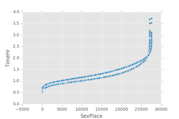
The sex of the runner was processed by looking at the two runners with the same sex place. This is a plot of those values:
Zooming in/analyzing that plot shows that males always have a better sex placement than females, up until about place 25,000. Using that heuristic, I just assigned sex to all runners with sex placement 25,000 and below to do some of the histograms. It leaves off the right-tails, but the points come across just fine without doing much extra work!
Off to the Races
Let’s see some plots, already! First up we’ll do some simple aggregate data plots.
Age Distributions
Apparently doing a 10K doesn’t really become popular until you turn about 25. Also, women are the ones running later into life. I’ll let you sort out the cause/effect with life expectancy by sex!
Race Time Distributions
The cutoffs at the end of the plot of times by sex is because I only defined a sex for runners below a sex place of 25,000. The tails will continue to fall off at about the same rate, so we aren’t missing much here (even if it is a bit of a shortcut).
Age vs. Race Time
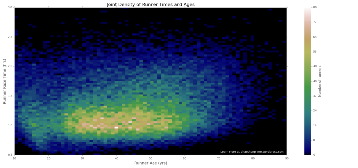
Now we get into the more interesting 2D density plots.
This lets us look at the overall density, as well as examine the marginal densities for each age. Most runners take about an hour to run the race, and that density is stacked with the distribution we’ve already seen of ages (notice the jump around 25 years of age).
The surprising thing, to me, was that there wasn’t a very extreme drop off of race time with age. Everyone of all ages is coming out at different ability levels, and that’s awesome for the race!
Race Time vs. Bib Number
This plot shows the structure of how fast runners are in each wave. You can see the waves as distinct bands of bib numbers.
Notice how later waves are more spread out, as they include slow runners/walkers along with faster runners who started later (for whatever reason, such as delays arriving to the start).
Runner Start Time vs. Bib Number
This plot shows the wave start time structure. In a race where everyone only runs in their wave (or a later one), that plot should only have data above and on the diagonal. The points below the diagonal are bib numbers running earlier than their wave.
This is where we first see the impact of the lightning. That large delay in start times is due to the lightning. What I want to know is why there are still runners with start times before the official restart at around a race clock time of 1.6 hours! Either it was people just going through, or a race clock time error of some kind. If it is an error, it didn’t affect the data on the runner’s times (as far as I can tell). Previous year’s data has the same structure in the other plots, at least.
Runner Start Time vs. End Time
This is an alternate way of viewing the bib number vs. race time plot, but this time it combines all the features (waves, lightning, and race times vs. expected race times).
Final Notes
I hope you enjoyed looking at the interesting structures in the plots. One of my favorite things about this data is that you don’t need complex stats to tell a story. The raw data, on its own, elicits all the information you need to see and think about what’s going on during the race.
For the nerdy, let’s talk color maps.
I’ve been watching the SciPy 2015 videos, including one on colormaps. I usually avoid doing the ‘better’ maps, like CubeHelix, because I never have data with a wide enough spread to make it worthwhile. As much as it hurts to say it, Jet does a pretty good job (for me) of distinguishing between data that doesn’t have all that much resolution between it, and you want to point out small differences quickly. With this data, for example, I want the difference between 0 and 1 to be very noticeable (without defining custom colormaps to handle that).
Playing around with the different matplotlib colormaps, though, gist_earth seemed to do a pretty good job of providing a non-jarring transition through the data values while still maintaining distinguishability. I’m looking forward to playing around with the new colormaps, though.


Love all the data analysis – thanks for sharing this, so interesting.
LikeLiked by 1 person
Thank you! Glad you enjoyed it.
LikeLike